KIKI WHISKY
BRIEF
Design new whisky product and build a prototype desktop & mobile e-commerce website.
role
UI / UX Design, Product Design, Branding
client
Myself / Solo Project
tools
Figma, Photoshop, Illustrator
Ideal customer is a man named Elias. Elias is in his early 40’s and is married with no children. He is a high school graduate and owns a small business. Elias lives in London, is very familiar with your product and has a small budget.
research
From researching competitor branding and design I found a lot of brands using a similar style; Natural dark / muted hues of beige, brown, navy and burgundy. Heavy typefaces in headings mixed with traditional serif paragraphs.
Checkout process on most sites was fairly straightforward. Found some of the sites to be a little clunky, perhaps designed to be easy to use. Some had an overwhelming number of links and amount of information.
KEY TAKEAWAYS
Strong branding and theme
Include a story page to share the vision and process.
Distillery imagery to help evoke trust and knowledge of the industry
Landscape photography of area company is based
Account option for loyal returning customers
Location service for price / shipping costs.
IDEA
I wanted to design a product that may entice a
new audience. To be innovative and modern.
To break out of the traditional but keep the
connection with it’s Scottish heritage.
To be simple, bold, unique
and captivating.
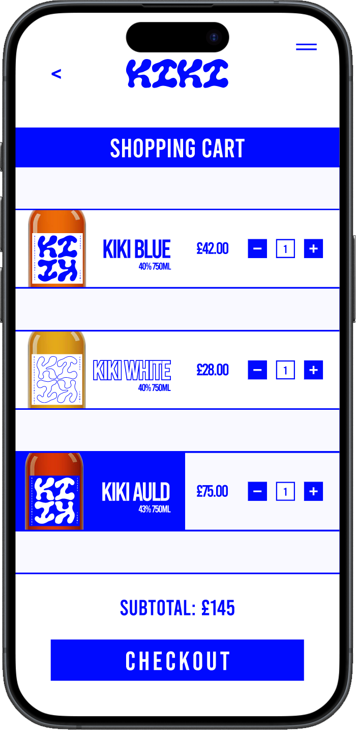
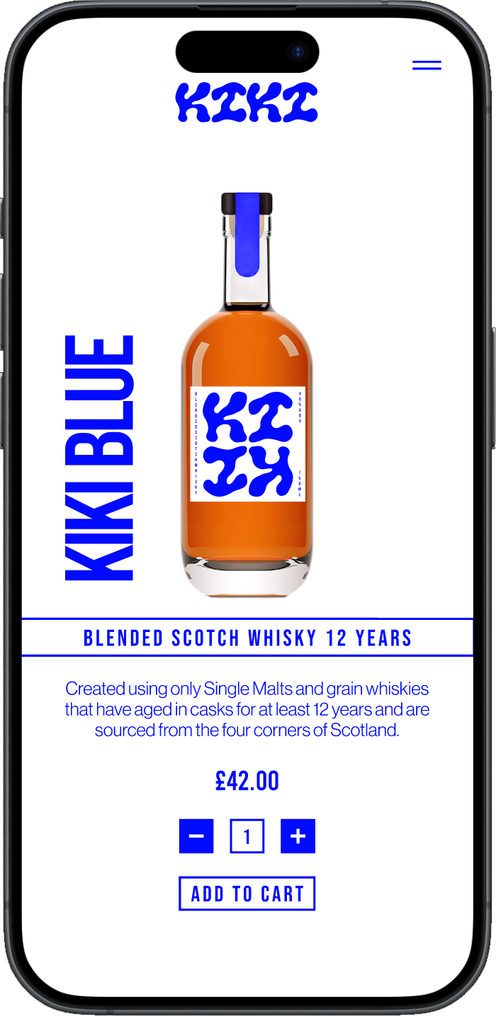
TASK FLOW
wireframe
Using the colours of the Scottish flag only, saturated slightly, to keep a theme throughout.
The contrast compliments the orange/amber hues of the whisky.
logo
The logo was designed to symbolise individuality, uniqueness and subtly resemble islands.
Bold, curvy font double stacked and rotated, encouraging the customer to pick up and turn the bottle.
In the very centre the Scottish flag is revealed.
STYLE
FONTS
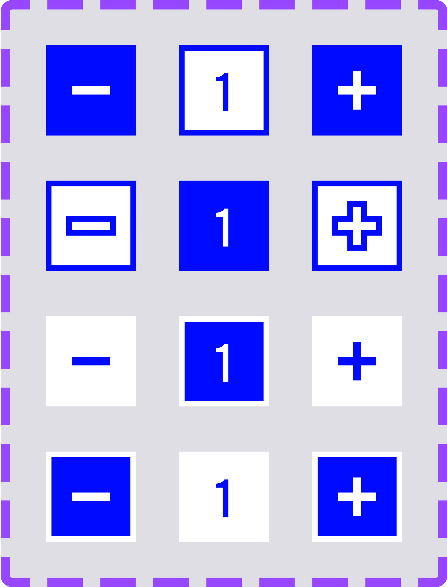
BUTTONS
COMPONENTS
The UI design around the product was made rigid in comparison to the logo.
Boxes and grids in contrast to the curvy font to make it stand out.


